Glossary
Logout
©Copyright Arcturus 2022, All Rights Reserved.
7
Terms & Conditions
|
|
|
|
Security & Privacy
Contact
PROBLEM SOLVING TOOLS
|Introduction
|Mindmap - Problem, Cause, Factor
|Histogram
|Scatter Diagram
Purpose
To develop thinking skills in order to come up with superior business results. Exploit opportunities.
Objectives
- Practised how to identify opportunities, anticipate and identify key issues
- Practised ways to analyse the situation and identify critical factors in the situation
- Applied creative models to invent alternative solutions (reapplying ideas, reshaping ideas, generating new ideas)
- Practised ways to decide on most plausible solutions
- Prepared a presentation (opportunity/issue sheet) and an action plan for implementation
- Understood the need for a measurement system to monitor results
- Fishbone Diagram
- Force Field Analysis
- Pareto Chart
- Mindmap - Problem, Cause, Factor
- Scatter Diagram
- Histogram
- Control Charts
- Quality Evolution Chart
- Quote
(Re) Defining the Issue
- Involving others
- Problem Statement Ladder
Purpose
Analyse in a systematic way factors that cause problems. Identify important factor(s).
Attitude
Helicopter view
Questioning mode: Where? When? What? Who? Why? How?
Questions to ask could be:
- Why does this problem occur?
- What is the context in which the problem occurs?
- Why does the problem occur now? What is different from other times?
- What are likely causes of this problem?
- What are the limitations in time? in money?
- What resources in terms of people and/or equipment are involved?
- What were the main causes of similar problems?
- Which of the identified causes is unchangeable? Which can be changed easily?
- Which of the identified causes is risky to change?
- Which of the identified causes is likely to have the highest impact on the result?
Overview of Analysis Techniques
Fishbone Identify key and related factors
Force field analysis Identify driving and restraining forces
Pareto chart Highlight most important causes
Mindmap - problem, cause, factor Identify key and related factors
Scatter diagram Evaluate relationship between variables
Histogram Visualise overall pattern of variation
Control chart Differentiate between common causes and special causes of variation
Quality evolution chart Subsequent division into greater detail
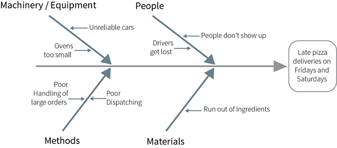
Technique to systematically identify a wide variety of potential causes of a problem and to show relationships among the causes.
Used to:
- Get at the root causes of a problem
- List as many potential causes of a problem as possible
- Show systematic relationships amend the causes
- Create team understanding and judgement about the root causes to work on
- Help direct and prioritise efforts
Procedure:
- Write the problem at one side of the paper and draw a central arrow pointing to it.
- Draw in the main categories.
- Use arrows pointing towards large central arrow.
- Use categories of causes that are useful and make sense to you. A common way is to use people, materials, equipment, environment and methods.
3. Brainstorm specific causes.
- Think of the causes within main categories.
- Draw them on line off the main categories.
4. Brainstorm sub-causes.
- Think specifically of sub-causes of the larger causes.
- Draw them on lines off the specific causes.
5. Be open and non-judgemental to all suggestions which relate to the problem so that others can understand
and build on their ideas.
6. Look over the completed fishbone and agree on the critical or root causes to address.
Technique to systematically identify the forces that are driving towards and working against a particular goal you are trying to achieve.
Used to:
- Discover obstacles
- Uncover positive elements of support that you might not have considered
- Anticipate special factors/needs while preparing for implementation.
Procedure:
- Choose solution or situation to analyse (with group / individually). Define present state. Define desired state.
- Set up chart.
3. List driving and restraining forces.
- Brainstorming.
- Consider internal and external forces.
- Think of what to do about restraining factors.
- Think of ways to capitalise on driving factors.
4. Identify major factors.
Method of organising and analysing data by causes of variation. It is a series of bars whose heights reflect the frequency or impact of causes of problems.
Used to:
- Organise and analyse data collected about causes of variation or non-conformance.
- Point out main causes for non-conformance to requirements
- Separate "critical few" you should be working on from the "trivial many" you often attempt to handle
- Assist in making decisions about which cause to attack first.
Procedure:
- Decide on the categories to be analysed.
- Choose sensible categories of causes. You may find it useful to think of where, when, what, who, why and how the problems occur.
- Use fish-boning to help find root causes of the problem.
- Use those categories on the data sheet.
2. Collect and display the data.
- Count the frequency of each cause of non-conformance to requirements.
- Make a bar for each cause, with the height representing the frequency of that cause.
- Arrange the bars in descending order of height, with the category representing the most frequent cause first and so on to the least frequent cause.
- The diagram will show the most important causes.
3. Check for a Pareto pattern.
- A Pareto pattern typically shows about 70 to 80% of the variation due to 2 or 3 of the causes, often identifies one cause that accounts for 50% or more.
- Generally, if you don't see a Pareto pattern, you can recast the data into different categories and obtain a Pareto distribution.
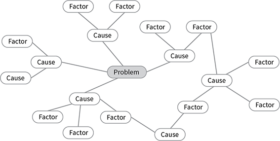
Technique to analyse wide variety of causes and the factors that contribute to the causes of a problem.
Used to:
- identify as many potential causes of a problem as possible
- show systematic relationships among causes
- clearly understand the broader context of a problem.
Procedure:
- Describe the problem concisely in the centre of a sheet of paper and draw a circle round the description.
- Think through the major causes of the problem and write them on your sheet. Position them around the problem, drawing a circle round each cause and a line connecting each cause to the problem. Try to identify between four and eight major causes.
- You now have a ring of causes surrounding the problem. Think about the factors which contribute towards each cause and write these onto your Mindmap - Problem, Cause, Factor. Circle the factors and draw lines connecting each factor to the cause (or causes) to which it relates.
- The Mindmap - Problem, Cause, Factor will show how causes relate to each other, hence guide you in identifying most relevant factors.
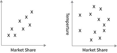
Technique to graphically identify causes of variation of a problem or process.
Used to:
- plot data along horizontal and vertical axes, which represent two factors that are believed to be related
- conclude that two factors are related in a causal way.
Procedure:
- Identify the two factors that are believed to be related and the direction of causality (e.g. A causes or has effect on B).
- Record the values that factor A and B have at several points in time (10 or more):
Example:
Time Value of Cause A Value of Cause B
1 10 1
2 12 2
3. Use the horizontal axis for the values of factor A (the assumed cause); use the vertical axis for the values of B (the result).
4. Put one point on the graph for each observation representing the values of factors A and B at one point in time. Note
that time is not shown on the graph.
5. The shape of the resulting scatter of points reveals the degree to which the two variables are related. If the points on the
scatter plot seem to fall near a line (which need not to be straight) then we often conclude that the two factors are
related in a casual way.
Examples:
Outliers:
observations that are well outside of the cluster that the other points seem to form. These points usually represent a special cause that is worth investigating. After looking into details of the situation, there might be sufficient justification for dropping the specific observation.
One can calculate the mathematical relationship between the two factors e.g. correlation coefficient and/or regression analysis (for reference see Excell User's Guide and Introductory Statistics, 2nd edition by Wonacott & Wonacott, 1972).
A bar chart that summarises the variation in a problem or process. Specification (spec) limits may be added to a histogram to indicate to which degree the problem/process is meeting requirements.
Used to:
- visually demonstrate the overall pattern of variation (spread, centring and shape) of the data you have
gathered about the process
- indicate whether a process has been meeting the requirements (histogram with spec limits).
Procedure:
- Gather a large enough number of data points to get a representative picture.
- Calculate the range: subtract the smallest data point from the largest. Determine the number of group intervals by dividing the range equally into about 6 to 16 groups. The size of each group will be depicted by a bar.
- Count the number of data points falling into each group interval. Mark the group intervals on the horizontal axis; draw the bar height to equal the frequency of data points in the group.
- Agree/check on requirements and what the specification limits are; draw these spec limits on the histogram by using vertical lines.
How to read a histogram:
- Analyse the extent of the variation by comparing the range, average and symmetry of various histograms.
There are three different measures used to analyse types of variation.
- Use the range to analyse variation in spread:
The range is the largest value less the smallest value in a given set of data. A wide range means wide variation, while a
narrow range means that variation is limited.
- The average is found by adding together all the values in a set of data and dividing that total by the number of values. When the average shifts, it may indicate that the process has changed.
- Test symmetry to analyse the variation in shape:
Divide the distribution into two parts, with the mean as the middle. Normally the two sides would be mirror images of
each other. If not it suggests the process needs investigation.
2. Determine the significance of the changes by comparing previous histograms. If the problem/process is in statistical
control (no or little variation in spread, centring or shape) then determine whether it is within specifications. If it is not
within specifications, determine whether it is because of shape, centring or spread, or a combination of these.
Technique to show for a problem/process (1) how a measure of the output varies over time and (2) what the normal range of variation is.
Used to:
- study the past performance of a process or to monitor an ongoing process
- signal when a search for special causes of variation is necessary
- help differentiate between common causes and special causes of variation so that the right corrective action can be taken.
Procedure:
- Draw a chart: on the vertical axis indicate what process output is being measured; on the horizontal axis, indicate time.
- Collect process data: decide on proper sample sizes.
- Plot data points as dots on the chart and connect the dots. Calculate the mean (add together all the values in a set of data and divide that total by the number of values) and draw the mean line.
- Calculate the upper and lower control limits and indicate both by horizontal lines on the chart.
Formulas:
X Chart (Mean)
Upper Control Limit (UCL) = X + A R (*)
Lower Control Limit (LCL) = X - A R (*)
R Chart (Range)
Upper Control Limit (UCL) = D R (*)
Lower Control Limit (LCL) = D R (*)
(*) A / D / D: see Appendix: Factors for Computing Control Limits
5. Verify that all data points are within the limits, which indicate stability. Points outside the control limits, or several points
displaying a clear trend, are an indication of an abnormal variation, hence suggest a special cause to look for.
|Searching for Causes and Focusing on Relevant Causes
|Understanding the issue
|Fishbone Diagram
|Force Field Analysis
|Pareto Chart


|Quality Evolution Chart
T (Mean)
Upper Control Limit (UCL) = X + A R (*)
Lower Control Limit (LCL) = X - A R (*)
R Chart (Range)
Upper Control Limit (UCL) = D R (*)
Lower Control Limit (LCL) = D R (*)
(*) A / D / D: see Appendix: Factors for Computing Control Limits
5. Verify that all data points are within the limits, which indicate stability. Points outside the control limits, or several points
displaying a clear trend, are an indication of an abnormal
|Interactive Business Models, Workshop Tools & Professional Resources
The IPM practitioner series, is a definitive and integrated training programme for management professionals operating in the Product Management arena. So whether you’re the Managing Director, Product Director, Product Manager or a member of the Multidisciplinary Team we are confident that you will find this particular training series to be one of the best available and an invaluable asset to both you and your company.
PMM - Professional Support


